参考资料:
/*滚动方向x轴,任何时候都强制滚动*/
scroll-snap-type: x mandatory;

/*滚动方向y轴,接近容器边缘时才滚动*/
scroll-snap-type: y proximity;

/*滚动方向任意,强制滚动*/
scroll-snap-type: both mandatory;
语法:
none | [ x | y | block | inline | both ] [ mandatory | proximity ]?
-
mandatory如果它当前没有被滚动,这个滚动容器的可视视图将静止在临时点上。意思是当滚动动作结束,如果可能,它会临时在那个点上。如果内容被添加、移动、删除或者重置大小,滚动偏移将被调整为保持静止在临时点上。
-
proximity如果它当前没有被滚动,这个滚动容器的可视视图将基于基于用户代理滚动的参数去到临时点上。如果内容被添加、移动、删除或者重置大小,滚动偏移将被调整为保持静止在临时点上。
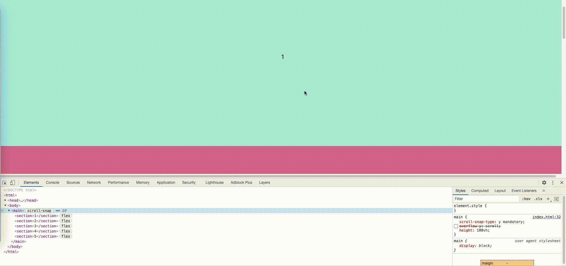
下图是滚动条在 body 上而非直接父容器上,导致 scroll-snap-type 失效
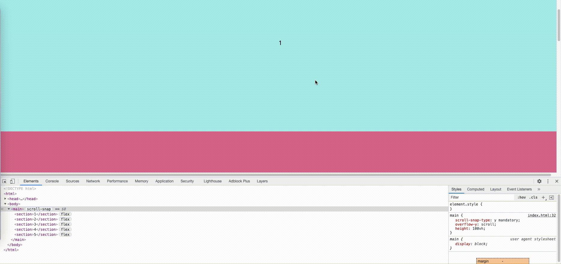
下图是在直接父容器中使用overflow:scroll使得 scroll-snap 生效
scroll-snap-align: center

scroll-snap-align: start

scroll-snap-align: end
源码:
<!DOCTYPE html>
<html>
  <head>
    <meta charset="UTF-8" />
    <meta http-equiv="X-UA-Compatible" content="IE=edge" />
    <meta name="viewport" content="width=device-width, initial-scale=1.0" />
    <title>css-scrollsnap</title>
  </head>
  <style>
    body {
      margin: 0;
    }

    iframe {
      border: none;
      width: 80%;
      height: 80%;
    }

    section {
      display: flex;
      flex-direction: column;
      align-items: center;
      justify-content: center;
      font-size: 20px;
    }

    section:nth-child(odd) {
      background: paleturquoise;
    }

    section:nth-child(even) {
      background: palevioletred;
    }
  </style>

  <style>
    main {
      scroll-snap-type: y mandatory;
      /* scroll-snap-type: y proximity; */
      /* 需要把滚动条设置在直接父容器上,
    scroll-snap-type才能生效,
    默认是body上,现在使用了overflow:scroll滚动条在main上了
    */
      overflow-y: scroll;
      height: 100vh;
    }

    section {
      width: 100vw;
      height: 80vh;
      scroll-snap-align: center;
      /* scroll-snap-align: start; 容器顶部和元素顶部对齐 */
      /* scroll-snap-align: end; 容器底部和元素底部对齐 */
    }
  </style>

  <body>
    <main>
      <section>1</section>
      <section>2</section>
      <section>3</section>
      <section>4</section>
      <section>5</section>
    </main>
  </body>
</html>用于有 sticky 元素时的滚动内边距。
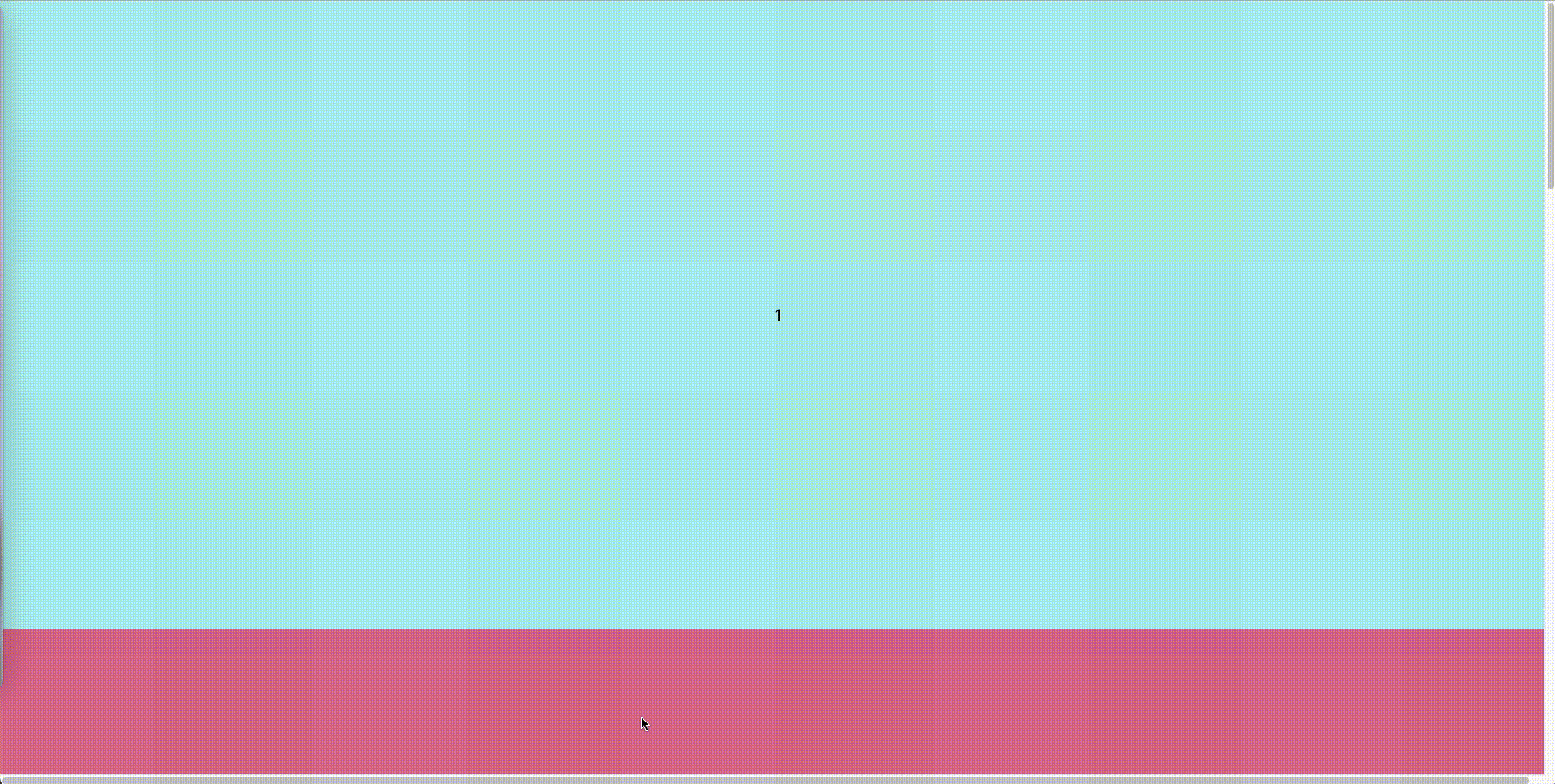
但我们容器中有一个 sticky 元素时,直接父级容器元素不使用 scroll-padding,则会将 sticky 元素的顶部作为滚动临界线,效果如下:
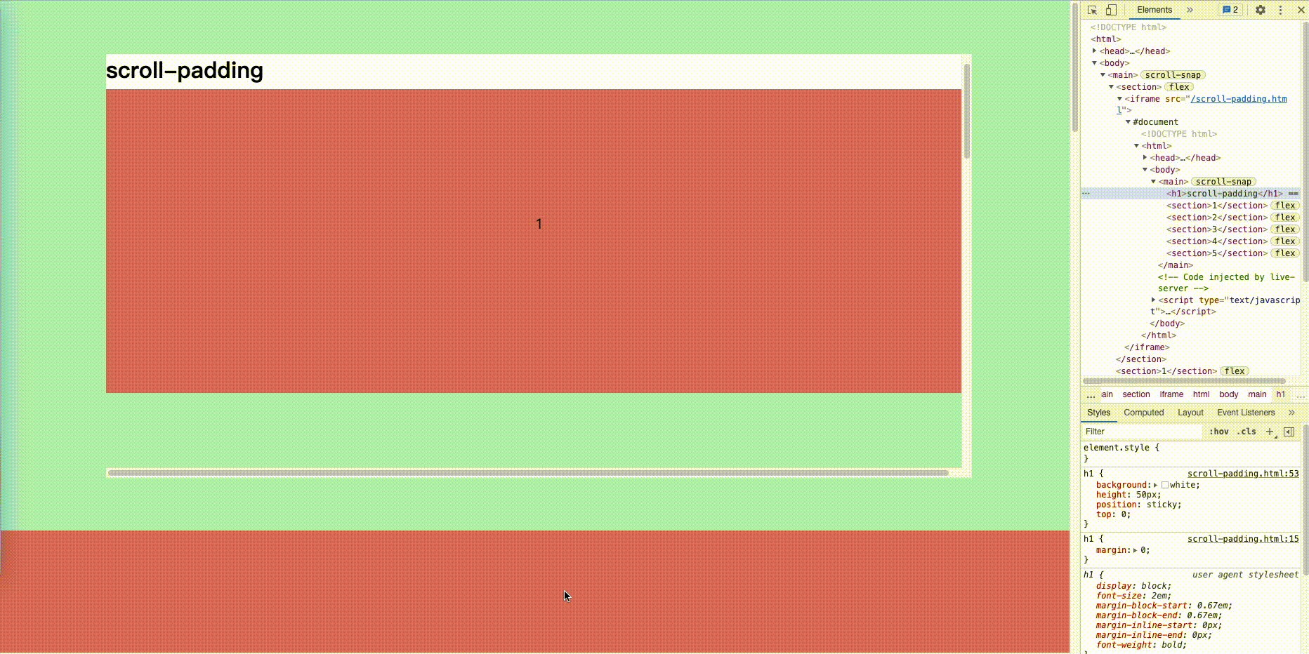
当我们使用 scroll-padding 时,则会将 sticky 元素的底部作为滚动临界线,并达到预期效果。

源码:
<!DOCTYPE html>
<html>
  <head>
    <meta charset="UTF-8" />
    <meta http-equiv="X-UA-Compatible" content="IE=edge" />
    <meta name="viewport" content="width=device-width, initial-scale=1.0" />
    <title>scroll-padding</title>
  </head>
  <style>
    body {
      margin: 0;
    }

    h1 {
      margin: 0;
    }

    section {
      display: flex;
      align-items: center;
      justify-content: center;
      font-size: 20px;
    }

    section:nth-child(odd) {
      background: paleturquoise;
    }

    section:nth-child(even) {
      background: palevioletred;
    }
  </style>

  <style>
    main {
      scroll-snap-type: y mandatory;
      overflow-y: scroll;
      height: 100vh;
      scroll-padding: 50px;
    }

    section {
      width: 100vw;
      height: 80vh;
      scroll-snap-align: start;
    }

    h1 {
      background: white;
      height: 50px;
      position: sticky;
      top: 0;
    }
  </style>

  <body>
    <main>
      <h1>scroll-padding</h1>
      <section>1</section>
      <section>2</section>
      <section>3</section>
      <section>4</section>
      <section>5</section>
    </main>
  </body>
</html>