A local school has decided to put together a flashcard application, Flashcard-o-matic, to help their students study online. Teachers will use this application to create decks of flashcards for the subjects they teach, and students will study the decks. The school needs you to build the application that the students and teachers will use.
- Live Demo
- Project Context
- Intended Use
- Features and Aspects
- Technologies and Tools
- API Details
- Screens
- Discoveries
- Future Goals
Click here to access the Live Demo!
Flashcard-o-matic is a web application designed to facilitate online study for students by using flashcards. Teachers can create decks of flashcards for various subjects, which students can then use to study effectively. The primary purpose of this project is to provide a practical tool for education while also showcasing web development skills using React.
Flashcard-o-matic is intended for educational purposes, allowing students to study using flashcards created by their teachers. It also serves as a demonstration project for web developers to understand and implement a full-stack application with React, including handling state, props, and routing.
- Purpose: Educational tool for creating and studying flashcards.
- User Roles: Teachers create and manage flashcards; students use them to study.
- Tech Stack: React for the front end, integrated with utility functions for CRUD operations.
- Navigation: Intuitive navigation through different screens using React Router.
- Responsive Design: Ensures usability across various devices.
- React: Used for building the user interface.
- React Router: For client-side routing to different screens.
- Bootstrap: For styling the application.
- CSS: Also for styling the application.
- Utility Functions: For handling API requests and state management.
Each Deck is an object with the following structure:
{
  "id": 1,
  "name": "Rendering in React",
  "description": "React's component structure allows for quickly building a complex web application that relies on DOM manipulation."
}There are two datasets that are a part of this project: decks and cards.
You can view all the data inside of the data/db.json file. Each data set can be accessed via a named property in this file. The following is a partial listing of the data in data/db.json:
{
  "decks": [
    {
      "id": 1,
      "name": "...",
      "description": "..."
    }
  ],
  "cards": [
    {
      "id": 1,
      "front": "...",
      "back": "...",
      "deckId": 1
    }
  ]
}
Each Deck is an object with the following shape:
{
  "id": 1,
  "name": "Rendering in React",
  "description": "React's component structure allows for quickly building a complex web application that relies on DOM manipulation. "
}
A Deck represents a collection of flashcards, or simply cards.
Each card is an object with the following shape:
{
  "id": 1,
  "front": "Differentiate between Real DOM and Virtual DOM.",
  "back": "Virtual DOM updates are faster but do not directly update the HTML",
  "deckId": 1
}
Each card represents a flashcard with a front, where the question is displayed, and a back, where the answer can be found. A card also contains the deckId, which matches the card to the deck that the card belongs to.
There are several utility functions exported from src/utils/api/index.js that allow you to perform create, read, update, and delete operations with the API server. You will need to select and use the appropriate functions in your React components.
Note that the updateDeck(), readDeck(), and listDecks() functions call the API server using URLs that include a query string of _embed=cards. The results of the API calls for these functions will contain both the deck and the cards associated with the deck, so you won't have to make additional API calls to load the cards for each deck when you use these functions.
Please read the documentation in the file for more information.
The following screens work with the above datasets.
The Home screen is the first page the user sees. It is displayed at /.
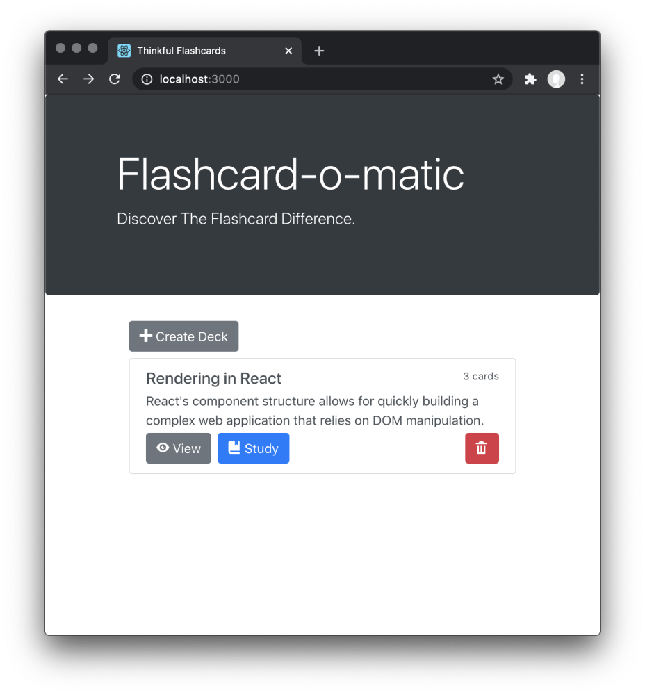
The Home screen has the following features:
- The path to this screen should be /.
- A Create Deck button is shown, and clicking it brings the user to the Create Deck screen.
- Existing decks are each shown with the deck name, the number of cards, and a Study, View, and Delete button.
- Clicking the Study button brings the user to the Study screen.
- Clicking the View button brings the user to the Deck screen.
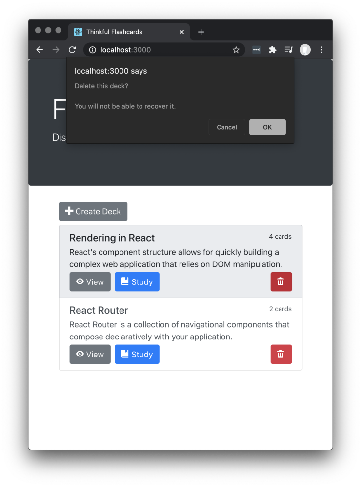
- Clicking the Delete button shows a warning message before deleting the deck.
When the user clicks the Delete button, a warning message is shown and the user can click OK or Cancel. If the user clicks OK, the deck is deleted and the deleted deck is no longer visible on the Home screen.
You can use window.confirm() to create the modal dialog shown in the screenshot below.
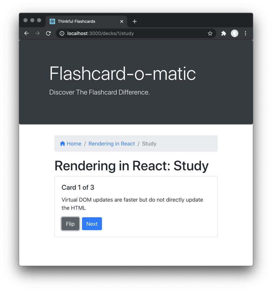
The Study screen is displayed at /decks/:deckId/study.
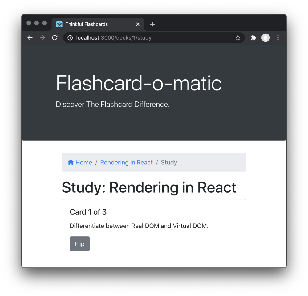
The Study screen has the following features:
- The path to this screen should include the deckId (i.e.,
/decks/:deckId/study). - You must use the
readDeck()function fromsrc/utils/api/index.jsto load the deck that is being studied. - There is a breadcrumb navigation bar with links to home
/, followed by the name of the deck being studied, and finally the textStudy(e.g.,Home/Rendering In React/Study). ` The deck title (i.e., "Study: Rendering in React" ) is shown on the screen. - Cards are shown one at a time, front-side first.
- A button at the bottom of each card "flips" it to the other side.
- After flipping the card, the screen shows a Next button (see the Next button section below) to continue to the next card.
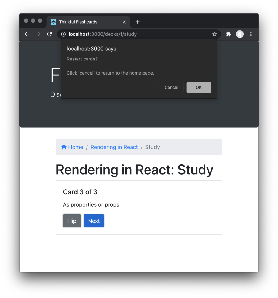
- After the final card in the deck has been shown, a message (see the Restart prompt section below) is shown offering the user the opportunity to restart the deck.
- If the user does not restart the deck, they should return to the home screen.
- Studying a deck with two or fewer cards should display a "Not enough cards" message (see the "Not enough cards" section below) and a button to add cards to the deck.
The Next button appears after the card is flipped.
When all cards are finished, a message is shown and the user is offered the opportunity to restart the deck. If the user does not restart the deck, they return to the home screen.
You can use window.confirm() to create the modal dialog shown in the screenshot below.
Studying a Deck with two or fewer cards should display a "Not enough cards" message and a button to add cards to the deck.
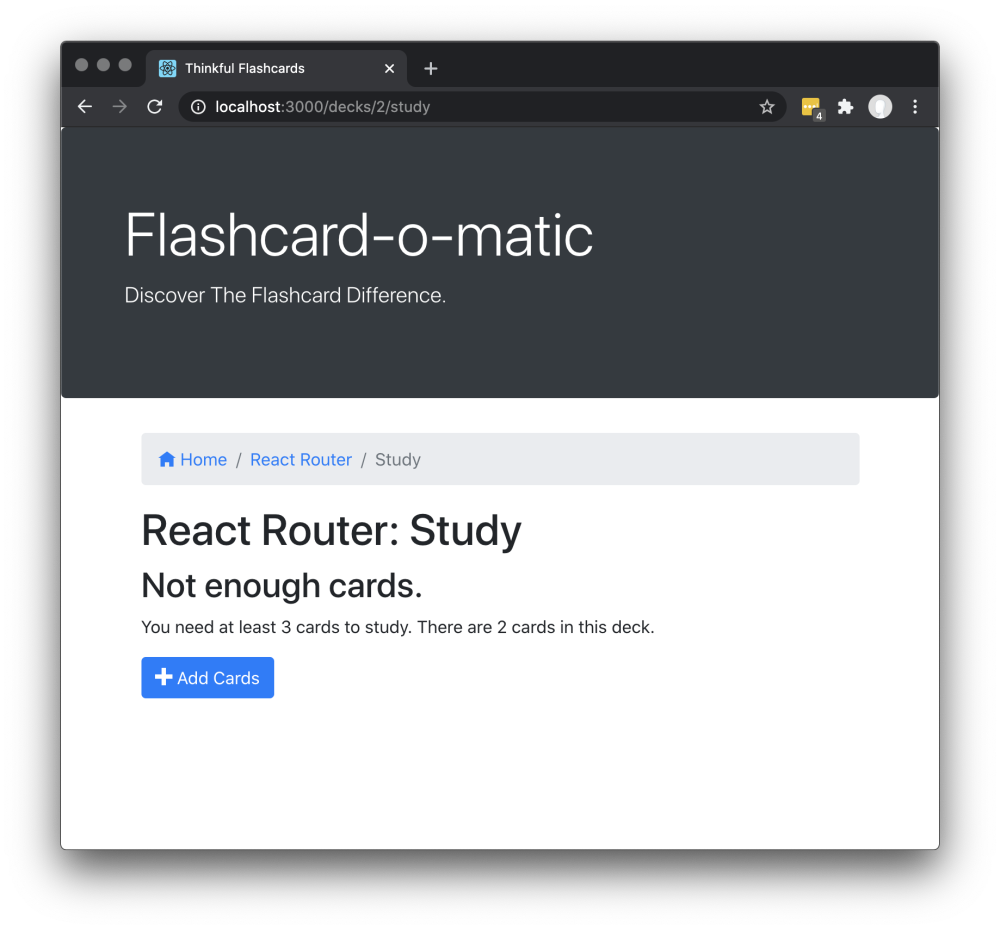
Clicking the Add Cards button should take the user to the Add Card screen.
The Home screen has a Create Deck button that brings the user to the Create Deck screen.
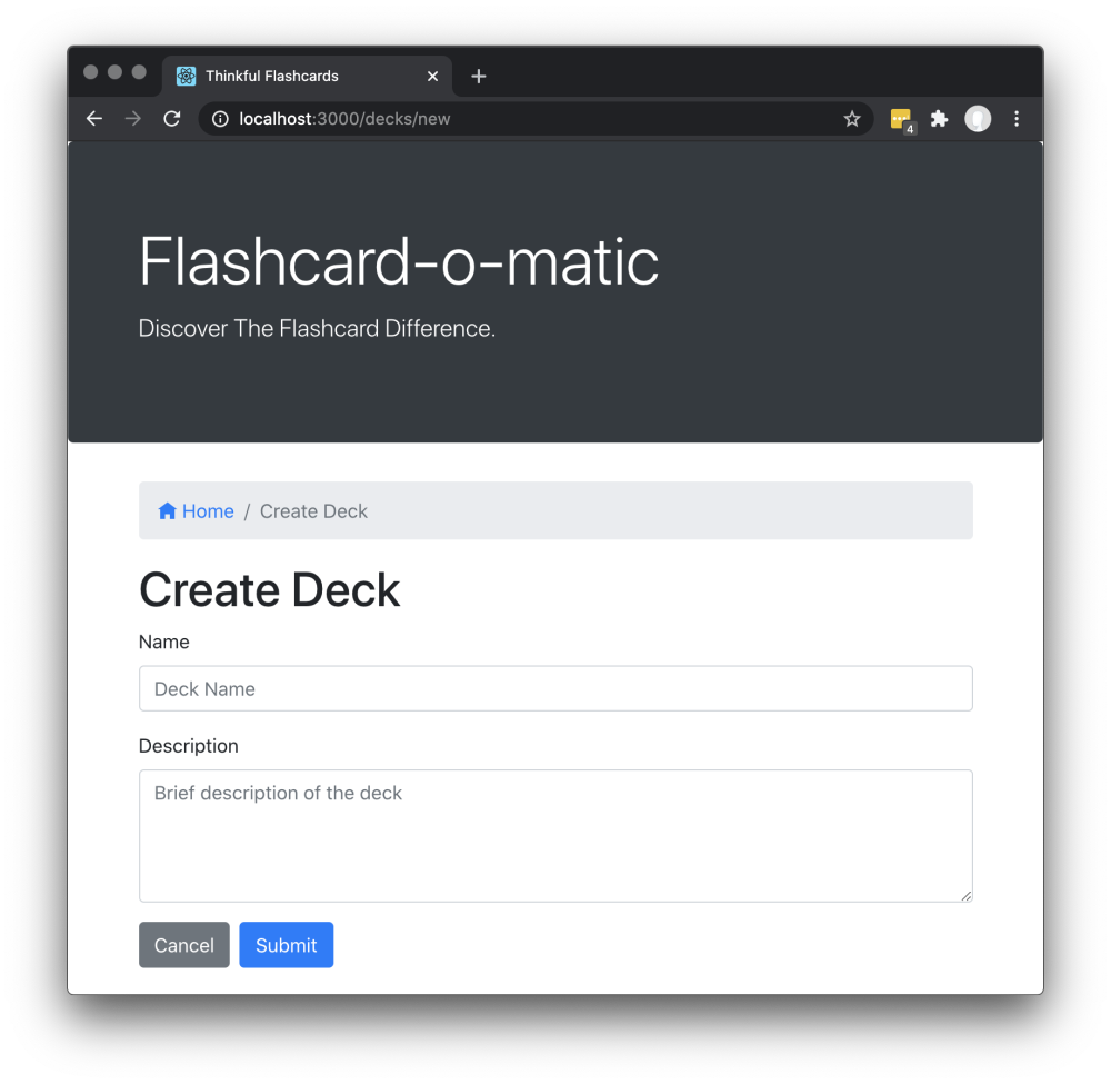
The Create Deck screen has the following features:
- The path to this screen should be
/decks/new. - There is a breadcrumb navigation bar with a link to home
/followed by the textCreate Deck(i.e.,Home/Create Deck). - A form is shown with the appropriate fields for creating a new deck.
- The
namefield is an<input>field of typetext. - The
descriptionfield is a<textarea>field that can be multiple lines of text.
- The
- If the user clicks Submit, the user is taken to the Deck screen.
- If the user clicks Cancel, the user is taken to the Home screen.
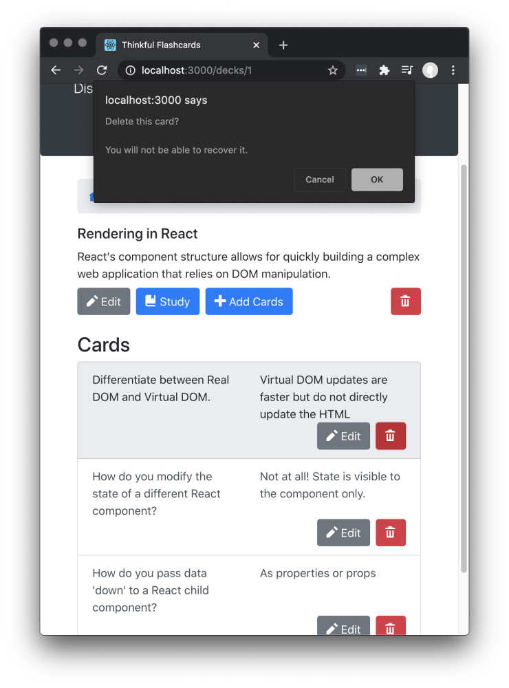
The Deck screen displays all of the information about a deck.
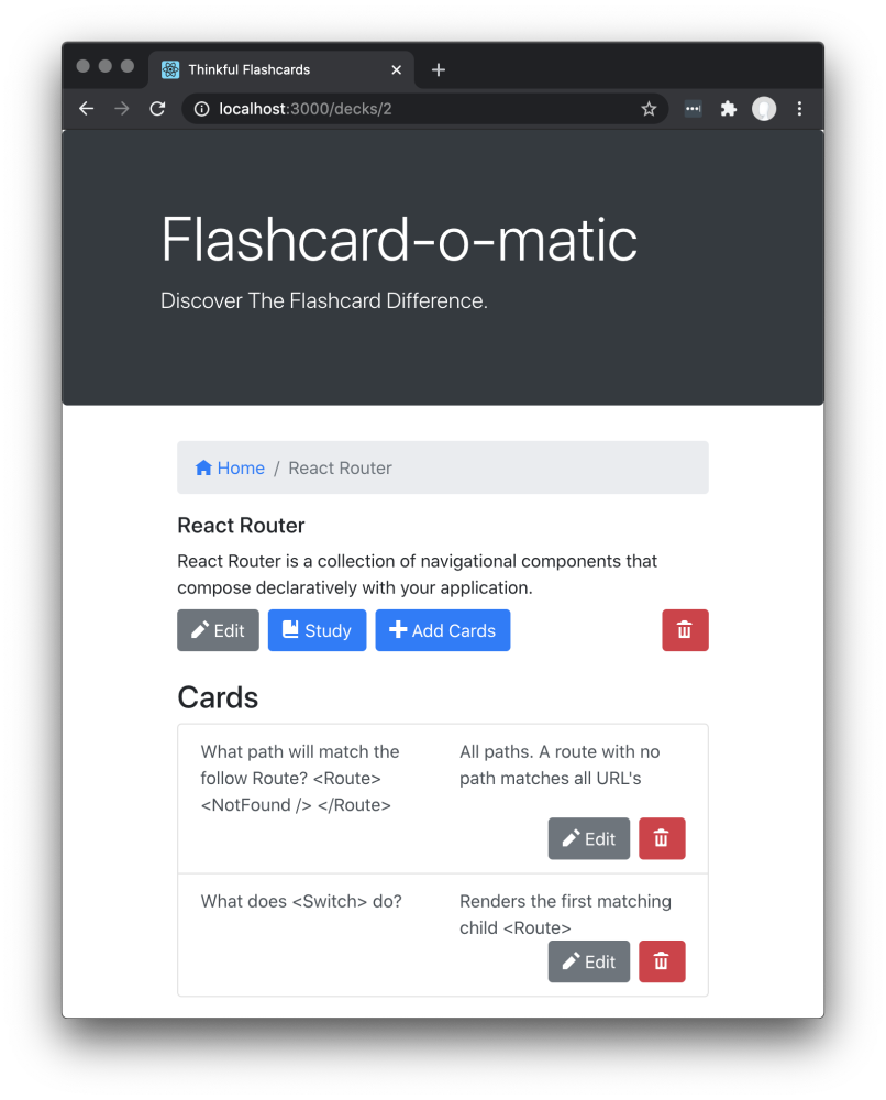
The Deck screen has the following features:
- The path to this screen should include the deckId (i.e.,
/decks/:deckId). - You must use the
readDeck()function fromsrc/utils/api/index.jsto load the existing deck. - There is a breadcrumb navigation bar with a link to home
/followed by the name of the deck (e.g.,Home/React Router). - The screen includes the deck name (e.g., "React Router") and deck description (e.g., "React Router is a collection of navigational components that compose declaratively in your application").
- The screen includes Edit, Study, Add Cards, and Delete buttons. Each button takes the user to a different destination, as follows:
| Button Clicked | Destination |
|---|---|
| Edit | Edit Deck Screen |
| Study | Study screen |
| Add Cards | Add Card screen |
| Delete | Shows a warning message before deleting the deck ( See the "Delete Card Prompt" section below) |
-
Each card in the deck:
- Is listed on the page under the "Cards" heading.
- Shows a question and the answer to the question.
- Has an Edit button that takes the user to the Edit Card screen when clicked.
- Has a Delete button that allows that card to be deleted.
When the user clicks the Delete button associated with a card, a warning message is shown and the user can click OK or Cancel. If the user clicks OK, the card is deleted.
You can use window.confirm() to create the modal dialog shown in the screenshot below.
The Edit Deck screen allows the user to modify information on an existing deck.
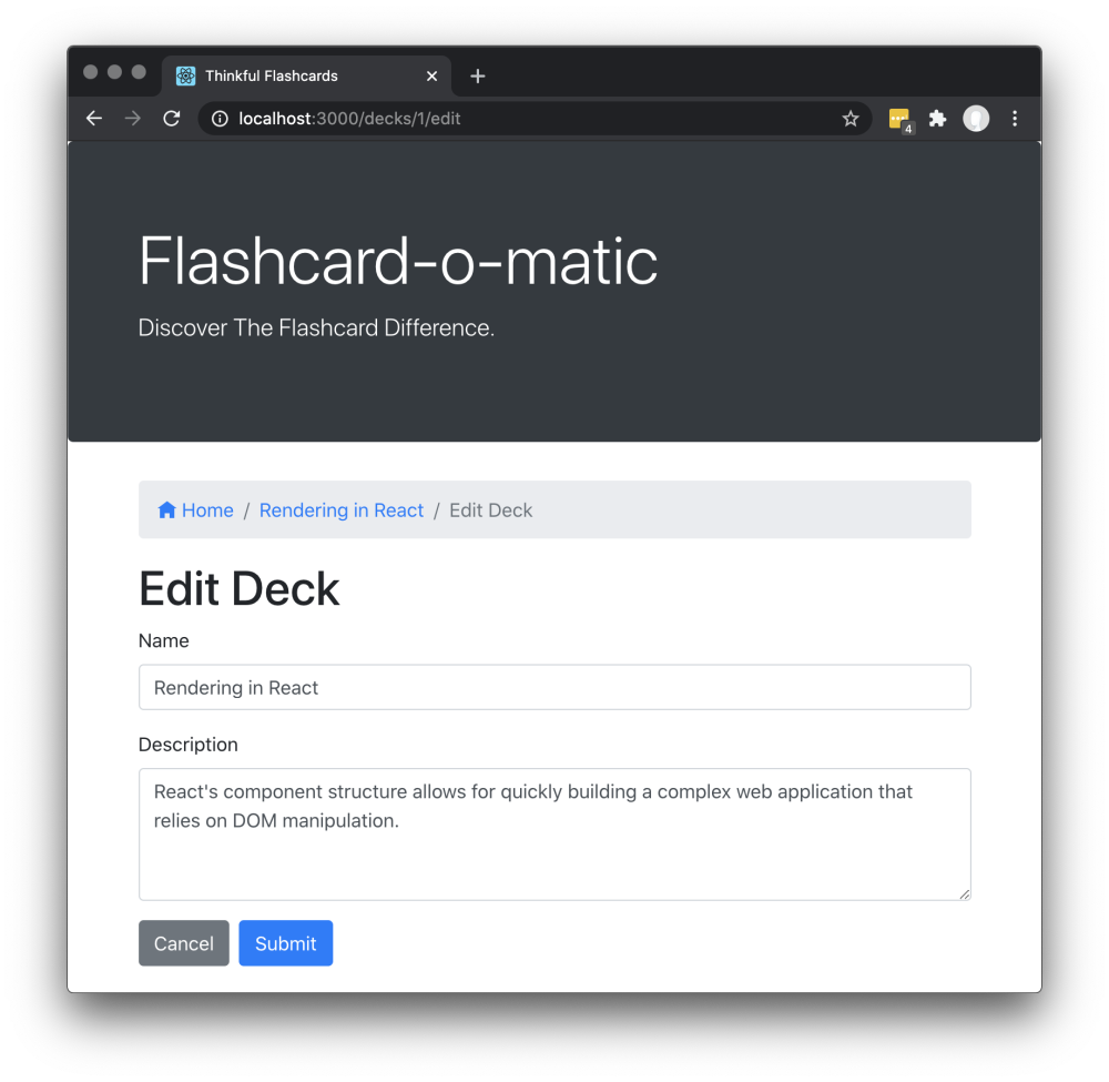
The Edit Deck screen has the following features:
- The path to this screen should include the deckId (i.e.,
/decks/:deckId/edit). - You must use the
readDeck()function fromsrc/utils/api/index.jsto load the existing deck. - There is a breadcrumb navigation bar with a link to home
/, followed by the name of the deck being edited, and finally the textEdit Deck(e.g.,Home/Rendering in React/Edit Deck). - It displays the same form as the Create Deck screen, except it is prefilled with information for the existing deck.
- The user can edit and update the form.
- If the user clicks Cancel, the user is taken to the Deck screen.
The Add Card screen allows the user to add a new card to an existing deck.
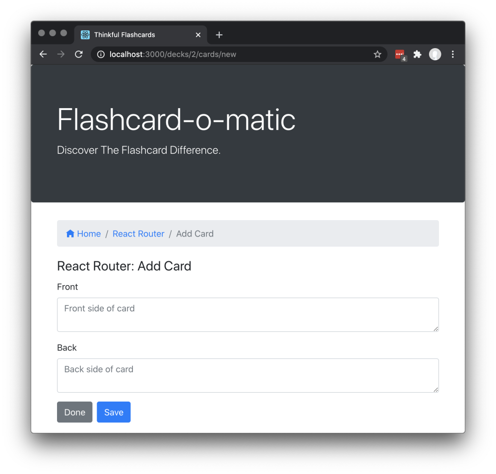
The Add Card screen has the following features:
- The path to this screen should include the deckId (i.e.,
/decks/:deckId/cards/new). - You must use the
readDeck()function fromsrc/utils/api/index.jsto load the deck that you're adding the card to. - There is a breadcrumb navigation bar with a link to home
/, followed by the name of the deck to which the cards are being added, and finally the textAdd Card(e.g.,Home/React Router/Add Card). - The screen displays the React Router: Add Card deck title.
- A form is shown with the "front" and "back" fields for a new card. Both fields use a
<textarea>tag that can accommodate multiple lines of text. - If the user clicks Save, a new card is created and associated with the relevant deck. Then the form is cleared and the process for adding a card is restarted.
- If the user clicks Done, the user is taken to the Deck screen.
The Edit Card screen allows the user to modify information on an existing card.
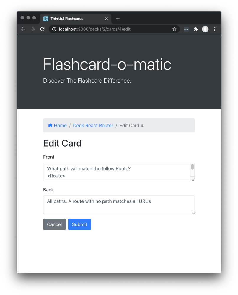
The Edit Card screen has the following features:
- The path to this screen should include the deckId and the cardId (i.e.,
/decks/:deckId/cards/:cardId/edit). - You must use the
readDeck()function fromsrc/utils/api/index.jsto load the deck that contains the card to be edited. Additionally, you must use thereadCard()function fromsrc/utils/api/index.jsto load the card that you want to edit. - There is a breadcrumb navigation bar with a link to home /, followed by the name of the deck of which the edited card is a member, and finally the text
Edit Card :cardId(e.g.,Home/Deck React Router/Edit Card 4). - It displays the same form as the Add Card screen, except it is prefilled with information for the existing card. It can be edited and updated.
- If the user clicks on either Save or Cancel, the user is taken to the Deck screen.
During the development of Flashcard-o-matic, I learned about effective state management in React, the importance of structured API interactions, and the benefits of React Router for seamless navigation.
- Implement user authentication for personalized experiences.
- Enhance the user interface with better animations and design elements.