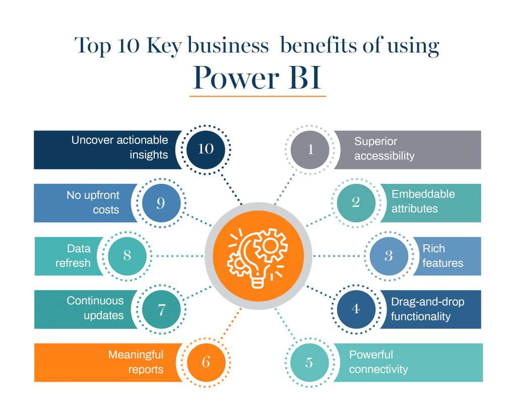
Welcome to the PowerBI Analytics Dashboards repository! This project showcases several interactive Power BI dashboards analyzing datasets from various domains. These dashboards aim to provide insightful visualizations and analytics for business and data analysis purposes.
This repository includes the following key dashboards:
Overview:
Analyze a survey dataset to gain insights into the careers, salaries, and job satisfaction of data professionals.
Key Dataset Features:
- Job Title: What title fits your current role?
- Career Transition: Did you switch careers into Data?
- Salary: Yearly salary (in USD).
- Industry: The industry you work in.
- Programming Languages: Most favorite languages.
- Job Satisfaction: How happy are you with your salary, work-life balance, coworkers, etc.?
- Other Metrics: Gender, age, ethnicity, education level.
Visualizations:
- 📊 Bar Charts: Compare the industry distribution and favorite programming languages.
- 📈 Line Graphs: Track salary trends over time.
- 🌍 Heatmaps: Analyze correlations between job satisfaction and other factors like salary, work-life balance.
- 🥧 Pie Charts: Gender, ethnicity, and education breakdown.
Overview:
An analysis of product sales in an apocalypse preparation store. Insights into customer purchases, units sold, and popular products.
Key Dataset Features:
- Customer ID: Unique customer identifier.
- Product ID: Identifies the purchased product.
- Units Sold: Number of units sold for each product.
- Date Purchased: When the purchase was made.
Visualizations:
- 📊 Bar Charts: Sales volume for top products.
- 📈 Line Graphs: Sales trends over time.
- 🗺️ Maps: Sales distribution by region.
- 🥧 Pie Charts: Sales by product category.
Overview:
A deep dive into Uber ride data, analyzing patterns like ride frequency, fare trends, and geographical hotspots.
Key Dataset Features:
- Trip Duration: How long each ride lasted.
- Pickup & Dropoff Locations: Geographical data points (latitude/longitude).
- Fare: Total ride cost.
- Ride Type: UberX, UberPOOL, etc.
- Timestamp: Date and time of each ride.
Visualizations:
- 🌍 Heatmaps: Popular pickup and dropoff locations.
- 📉 Line Graphs: Ride trends over time.
- 🚖 Pie Charts: Ride distribution by type (UberX, UberPOOL, etc.).
- 🗺️ Maps: Ride density across regions.
Overview:
An analysis of terrorist attack data, focusing on incidents across the globe as reported by the National Investigation Agency (NIA).
Key Dataset Features:
- Country & City: Where the attack occurred.
- Date: When the attack took place.
- Type of Attack: Bombing, shooting, etc.
- Fatalities & Injuries: Casualties from the attack.
- Perpetrators: Group or individuals responsible.
Visualizations:
- 📊 Bar Charts: Attack frequency by type.
- 🗺️ Geospatial Maps: Attack hotspots.
- 📉 Line Charts: Fatalities and injuries over time.
- 🥧 Pie Charts: Attack distribution by country and city.
Here are some of the most common visualization techniques used in the Power BI dashboards:
- 📊 Bar Charts: Great for comparing categories like industry distribution or product sales.
- 🥧 Pie Charts: Excellent for showing proportions, such as gender distribution or product category sales.
- 📈 Line Graphs: Ideal for analyzing trends over time, like salary trends or product sales.
- 🌍 Heatmaps: Used to show intensity or concentration of data, like job satisfaction or geographical patterns.
- 🗺️ Maps: Display data points on a map to highlight locations, like Uber ride density or terrorist attack hotspots.
- 🚖 Geospatial Maps: Visualize pickup and dropoff patterns (Uber ride analysis).
Power BI continues to be a transformative tool for business intelligence, empowering users to create compelling visualizations and gain deeper insights from their data. Through its wide range of capabilities, including interactive dashboards and advanced analytics, Power BI offers organizations the flexibility to make data-driven decisions with confidence.
The examples provided here highlight just a few ways that Power BI is being leveraged to enhance business analysis and reporting. With its robust features and seamless integration with other Microsoft tools, Power BI is an essential asset for any data-driven business.
Explore further and take full advantage of Power BI’s potential to unlock valuable insights and drive business success.
🎉 Start exploring and elevate your data game today! ✨


