


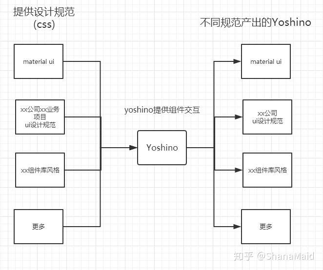
Yoshino本质上类似于Hexo,不同的样式风格组件类似于Hexo的各种theme,hexo官方仅提供了一套工具以及一个基础主题,Yoshino与其同理。
开发者只需要像配置Hexo主题一样使用即可拥有不同风格的组件,你甚至可以在同一个项目中使用cli输出多种不同风格的组件。
而不同主题的Yoshino需要开源社区完成,官方会提供类似的yoshino-theme-site来展示不同的主题,类似于hexojs/site
目前cli工具仅支持组件创建产出,例如创建自定义Alert组件
yoshino new Alert
以后cli可以通过类似以下的指令配置输出对应规范组件,例如输出material-ui规范的Alert组件
yoshino new Alert --theme material-ui
以及直接输出整个主题的组件库
yoshino new all --theme material-ui
- 使用
TypeScript开发,提供d.ts文件帮助开发者提高开发速度 - 提倡
OFA(one for all)与AFO(all for one)概念,不同项目开发前通过yoshino-cli根据项目ui规范进行定制化开发产出。 - 除了简单通用的
ui组件,yoshino抽离出了一些易用性比较高的特效(功能)组件,例如- Helpers
- Ripple
- Transitions
yoshino组件库提供简单样式组件,可以通过yoshino-cli根据项目进行定制化开发。
将yoshino组件库less抽离出来维护,让开发者自定义维护。 例如需要自定义Alert样式
import {Alert} from 'yoshino';
import 'myAlert.less'
myAlert.less为用户自定义样式
yoshino根据开发者需要自定义的组件自定义生成对应开发模版
yoshino new Alert
npm run dev // 启动开发环境
npm run new ComponentName // 新建组件