Replies: 3 comments 3 replies
-
|
Hi @nullgel - I love the look of your yearly graph with those moving averages. Can you share how you did that? For getting a graph to show the ratio of solar production over home usage, you could use a query like this: SELECT sum("solar")/sum("home")
FROM "kwh"."http"
WHERE $timeFilter GROUP BY time(1d) fill(0) tz('America/Los_Angeles')You would want to add a series override to move it to a separate axis so it shows up. Here is my test:
|

Beta Was this translation helpful? Give feedback.
-
|
The moving average was nothing special: Thank you for taking the time to generate that query, but (as usual) I don't think that I explained myself quite well enough. What I'm ultimately after, is knowing whether or not I'm getting close to owing money to my utility. My utility is a flat rate all day so I'm keeping an eye on how much energy I've banked up with them verses how much I'm importing from them. The number I'm generating instantaneously is pretty accurate, but I want to see its trajectory. It has to be a cumulative calculation for the entire year up to each day. Can you decipher what I'm getting at? Honestly, it may end up being too processor intensive to do what I want. |

Beta Was this translation helpful? Give feedback.
-
|
Thanks @nullgel - I love the simple moving-average graph you built. Looks nice. Ok, I think I understand what you are looking for. You are right, it is more complex. You want data points on the time series graph (t=0 to t=n) to be a sum of the (home/solar) for that duration. Assuming the graph you want is represented by function Is that right? If so, we can look at how we reduce or use that to plot. |
Beta Was this translation helpful? Give feedback.
-
|
Exactly! Yeah... I kicked it around for a few more hours yesterday with no
luck. It sure seemed simple at first glance, but it's tricky to implement.
…On Fri, Feb 10, 2023 at 1:10 AM Jason Cox ***@***.***> wrote:
Thanks @nullgel <https://github.com/nullgel> - I love the simple
moving-average graph you built. Looks nice.
Ok, I think I understand what you are looking for. You are right, it is
more complex. You want data points on the time series graph (t=0 to t=n) to
be a sum of the (home/solar) for that duration. Assuming the graph you want
is represented by function ratio(n). And home(n) and solar(n) are the
sums of home usage for the day n.
ratio(0) = (home(0)/solar(0))
ratio(1) = (home(0) + home(1)) / (solar(0) + solar(1))
ratio(n) = (home(0) + ... + home(n)) / (solar(0) + ... + solar(n))
Is that right? If so, we can look at how we reduce or use that to plot.
—
Reply to this email directly, view it on GitHub
<#176 (reply in thread)>,
or unsubscribe
<https://github.com/notifications/unsubscribe-auth/AGTUYXMFZ6WCUARU2BZRFE3WWXLVRANCNFSM6AAAAAAUVM35UE>
.
You are receiving this because you were mentioned.Message ID:
<jasonacox/Powerwall-Dashboard/repo-discussions/176/comments/4928596@
github.com>
--
Nate Winesett
|
Beta Was this translation helpful? Give feedback.
-
|
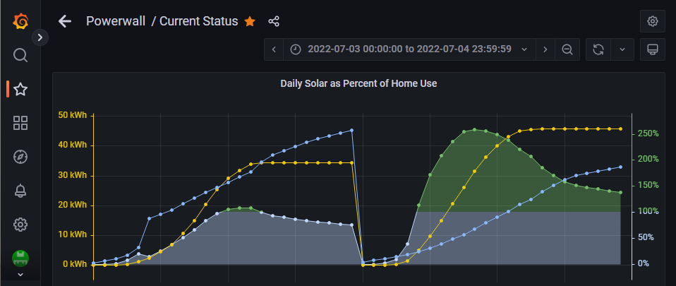
Those who've read a few of my posts won't be surprised that I went to MySQL to solve this... but I was able to do this using the KWH data that I copy to MySQL. It required the use of a CTE (common table expression) query. I can't write queries like this from scratch, I had to adapt it from something I found online that was showing how to do cumulative totals over time. I have no idea if anything like this is possible in InfluxDB. It definitely can't be done by the same method, as there is nothing like a CTE query in InfluxDB 1.8 AFAIK. I can add the details of how I built this to one of my posts about using MySQL if there's interest.
The yellow line is cumulative solar production. I only got my powerwalls at the end of February 2022, so the year's data starts there. This year so far looks like this:
I didn't originally read carefully enough, so the first thing I came up with was calculating the percentage on a daily basis, rather than annual, so it looked like this:
Here you can see the color fill changing when above 100%. At mid-day on the second day I had produced solar equal to 250% of that day's home use, and by the end of the day it was 138%. On the first day I only got slightly ahead on solar for a bit in the middle of the day, and ended the day having produced 76% of the home's use by solar. |


Beta Was this translation helpful? Give feedback.
-
|
@youzer-name - these are amazing! I think @nullgel was looking for the inverse (home/solar) but I like this look too! |
Beta Was this translation helpful? Give feedback.
-
A number that I'm obsessed with watching is the (hopefully positive) number denoting the amount of excess energy that I produce. I generate this number this way:
However, I would really like to watch this number over time in the year long graph:
(Note: In the above graph, the bright yellow line is a 30-day average of solar production and the bright blue is home usage)
But I am having a tough time getting it to work. I feel like I'm over-complicating it and would really appreciate some advice. Even a point in the right direction may be sufficient.
Thanks!
Beta Was this translation helpful? Give feedback.
All reactions