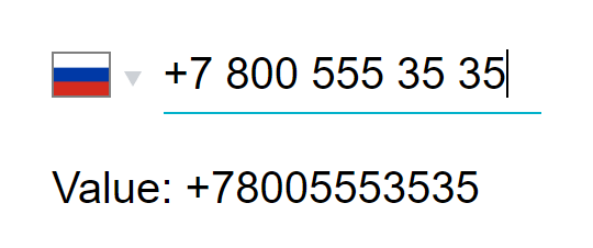
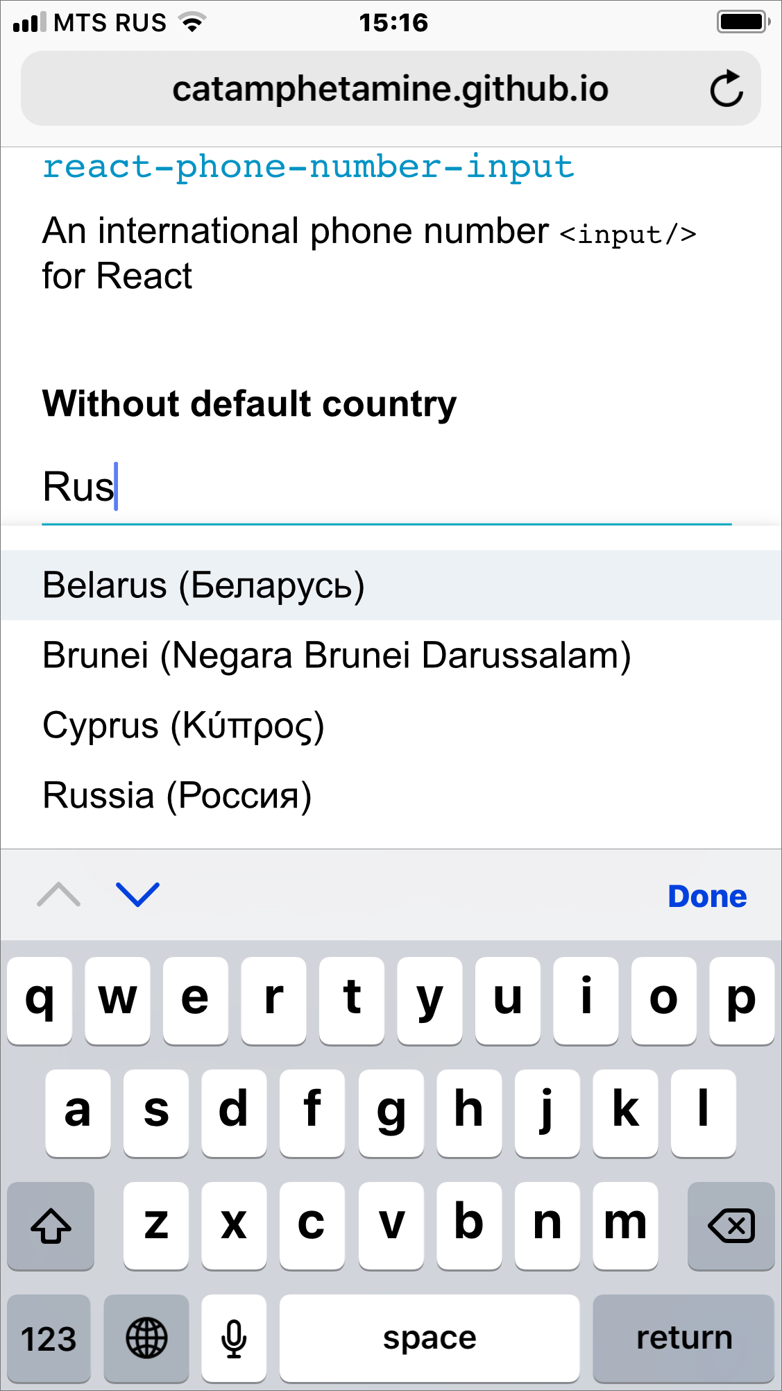
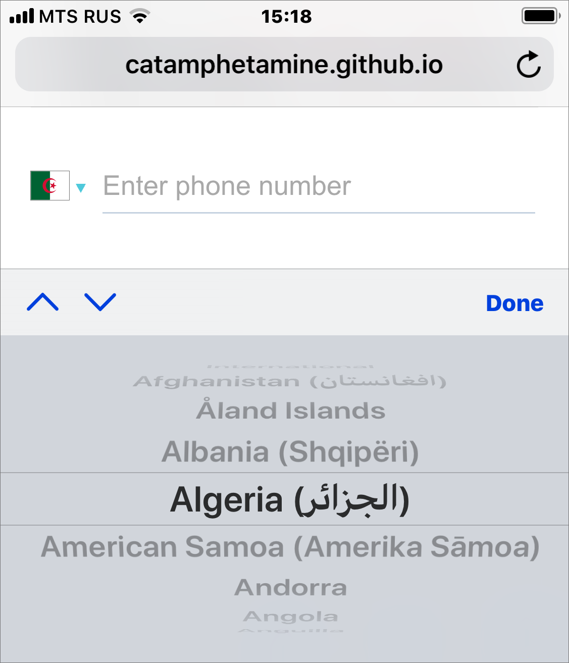
International phone number <input/> for React (iPhone style).
import PhoneInput from 'react-phone-number-input'

return (
	<PhoneInput
		placeholder="Enter phone number"
		value={ this.state.phone }
		onChange={ phone => this.setState({ phone }) } />
)
The international phone number input utilizes libphonenumber-js international phone number parsing and formatting library.
The phone number <input/> itself is implemented using input-format (which has an issue with some Samsung Android phones, see the workaround).
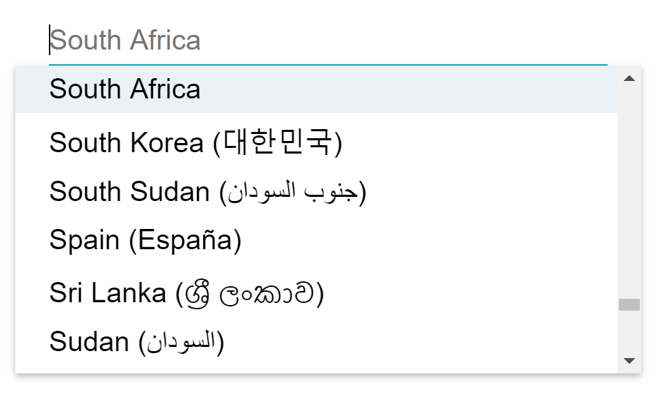
The countries dropdown with autocomplete is taken from react-responsive-ui.
I could also easily include all country flags in a form of <svg/> React elements as part of this library but the overall size of the bundle would then be about 3 MegaBytes (yeah, those SVGs turned out to be really huge) which is too much for a website. Therefore the default behaviour is a compromise: instead of pleloading the flags for all countries in the expanded list of countries only the flag for the currently selected country is shown. This way the user only downloads a single SVG image and is not forced to download the whole international flags bundle.
The CSS files for this React component must be included on a page too.
import 'react-phone-number-input/rrui.css'
import 'react-phone-number-input/style.css'
And set up a postcss-loader with a CSS autoprefixer for supporting old web browsers (e.g. last 2 versions, iOS >= 7, Android >= 4).
Get the rrui.css and style.css files from this package, process these files with a CSS autoprefixer for supporting old web browsers (e.g. last 2 versions, iOS >= 7, Android >= 4), and then include them on a page.
<head>
  <link rel="stylesheet" href="/css/react-phone-number-input/rrui.css"/>
  <link rel="stylesheet" href="/css/react-phone-number-input/style.css"/>
</head>There have been reports of some Samsung Android phones not handling caret positioning properly (e.g. Samsung Galaxy S8+, Samsung Galaxy S7 Edge).
The workaround is to pass smartCaret={false} property:
import PhoneInput from 'react-phone-number-input'

<PhoneInput
  smartCaret={false}
  value={this.state.value}
  onChange={value => this.setState(value)}/>
smartCaret={false} caret is not as "smart" as the default one but still works good enough (and has no issues on Samsung Android phones). When erasing or inserting digits in the middle of a phone number this caret usually jumps to the end: this is the expected behaviour because the "smart" caret positioning has been turned off specifically to fix this Samsung Android phones issue.
This component is based on libphonenumber-js which is a rewrite of Google's libphonenumber library which doesn't enforce any validation rules when entering phone numbers in "as you type" mode (e.g. when phone number is too long or too short).
For the actual phone number validation use libphonenumber-js: either a loose validation via parseNumber(value) or a strict validation via isValidNumber(value).
Make sure to wrap a <PhoneInput/> into a <form/> otherwise web-browser's "autocomplete" feature may not be working: a user will be selecting his phone number from the list but nothing will be happening.
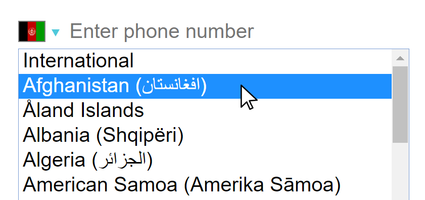
One can (and probably should) choose to use native HTML <select/> instead of react-responsive-ui <Select/> component, in which case use the react-phone-number-input/native export instead of the default one.
import PhoneInput from 'react-phone-number-input/native'

return (
  <PhoneInput
    placeholder="Enter phone number"
    value={ this.state.phone }
    onChange={ phone => this.setState({ phone }) } />
)
Native <select/> is the recommended one because it's more light-weight and doesn't require rrui.css file. In the next major version of this library (2.x) native <select/> will be the default one.
If you think that the phone number parsing/formatting/validation engine malfunctions for a particular phone number then follow the bug reporting instructions in libphonenumber-js repo.
The available props are
-
value— Phone number in E.164 format. E.g.+12223333333for USA. -
onChange— Updates thevalue. -
country— (optional) The country which is selected by default (can be set after a GeoIP lookup). E.g.US. -
countries— (optional) Only the specified countries will be selectable. E.g.['RU', 'KZ', 'UA']. -
flagsPath— (optional) A base URL path for national flag SVG icons. By default it loads flag icons fromflag-icon-cssgithub repo. I imagine someone might want to download those SVG flag icons and host them on their own servers instead. -
flags— (optional) Supplies<svg/>elements for flags instead of the default<img src="..."/>ones. This might be suitable if someone's making an application which is supposed to be able to work offline (a downloadable app, or an "internal" website):import flags from 'react-phone-number-input/flags'. -
flagComponent— (optional) A React component for displaying a country flag (replaces the default flag icons). -
nativeExpanded— If set totruewill render native<select/>when country select is expanded instead of the custom one (which has autocomplete feature). Deprecated. Use<PhoneInputNative/>instead. -
displayInitialValueAsLocalNumber— If set totruewill displayvaluephone number in local format when the component mounts or whenvalueproperty is set (see the example on the demo page). The default behaviour isfalsemeaning that if initialvalueis set then it will be displayed in international format. The reason for such default behaviour is that the newer generation grows up when there are no stationary phones and therefore everyone inputs phone numbers as international ones in their smartphones so people gradually get more accustomed to writing phone numbers in international form rather than in local form. -
error— aStringerror message that should be shown. -
indicateInvalid—errorwon't be shown unlessindicateInvalidistrue. The reason for this additional boolean flag is to enable some advanced ("smart") form field error indication scenarios.
For the full list of all possible props see the source code. All other properties are passed through to the <input/> component.
Country names can be passed via the labels property. E.g. labels={{ RU: 'Россия', US: 'США', ... }}. This component comes pre-packaged with a couple of ready-made translations. Submit pull requests for adding new translations.
import ru from 'react-phone-number-input/locale/ru'

<PhoneInput ... labels={ru}/>Some users asked for phone extension input feature. It can be activated by passing ext property (React.Element). The ext property is most likely gonna be a redux-form <Field/> (or simpler-redux-form <Field/>).
import React, { Component } from 'react'
import { Field, reduxForm } from 'redux-form'
import Phone from 'react-phone-number-input'

@reduxForm({
	form: 'contact'
})
class Form extends Component {
	render() {
		const { handleSubmit } = this.props

		const ext = (
			<Field
				name="ext"
				component="input"
				type="number"
				noValidate
				className={ className } />
		)

		return (
			<form onSubmit={ handleSubmit }>
				<Field
					name="phone"
					component={ Phone }
					ext={ ext } />

				<button type="submit">
					Submit
				</button>
			</form>
		);
	}
}
The code above hasn't been tested, but it most likely works. Phone extension input will appear to the right of the phone number input. One can always skip using ext property and add a completely separate form field for phone number extension input instead.
{ number, ext } object can be converted to RFC3966 string for storing it in a database.
import { formatRFC3966 } from 'libphonenumber-js'

formatRFC3966({ number: '+12133734253', ext: '123' })
// 'tel:+12133734253;ext=123'
Use the accompanying parseRFC3966() function to convert an RFC3966 string into an object having shape { number, ext }.
import { parseRFC3966 } from 'libphonenumber-js'

parseRFC3966('tel:+12133734253;ext=123')
// { number: '+12133734253', ext: '123' }One can use the exported <PhoneInput/> component for supplying custom country select and phone number input field components.
import { PhoneInput } from 'react-phone-number-input'

<PhoneInput countrySelectComponent={...} inputComponent={...}/>
For non-ES6-capable environment:
const PhoneInput = require('react-phone-number-input/custom').PhoneInputReact component for the country select. See CountrySelectNative and CountrySelectReactResponsiveUI for an example.
Receives properties:
name : string?— HTMLnameattribute.value : string?— The currently selected country code.onChange(value : string?)— Updates thevalue.options : object[]— The list of all selectable countries (including "International") each being an object of shape{ value : string?, label : string, icon : React.Component }.disabled : boolean?— HTMLdisabledattribute.tabIndex : (number|string)?— HTMLtabIndexattribute.className : string— CSS class name.
React component for the phone number input field. See InputSmart and InputBasic for an example.
Receives properties:
value : string— The parsed phone number. E.g.:"","+","+123","123".onChange(value : string)— Updates thevalue.country : string?— The currently selected country.undefinedmeans "International" (no country selected).metadata : object—libphonenumber-jsmetadata.- All other properties should be passed through to the underlying
<input/>.
Must also implement .focus() method.
By default all countries are included which means that libphonenumber-js loads the default metadata having the size of 75 kilobytes. This really isn't much but for those who still want to reduce that to a lesser size by generating their own reduced metadata set there is react-phone-number-input/custom export.
var PhoneInput = require('react-phone-number-input/custom').default
var metadata = require('./metadata.min.json')

module.exports = function Phone(props) {
	return <PhoneInput { ...props } metadata={ metadata }/>
}
For generating custom metadata see the guide in libphonenumber-js repo.
This error means that your Webpack is misconfigured to exclude .json file extension from the list of the resolved ones. To fix that add it back to resolve.extensions.
{
  resolve: {
    extensions: [".js", ".json", ...]
  }
}
If you're using Webpack 1 then upgrade to a newer version.
React Responsive UI component library.
