Token name structure
Token names are made up of parts. We have some documentation of the basic categorization of these parts on the Spectrum website.
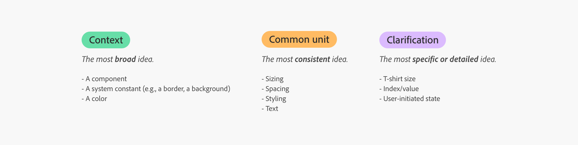
As I have been auditing these name parts, I have found repeating trends that could be broken into more granular categories.
- These are either globally shared or generic component parts or specific components.
- Examples:
-
field-edge-to-text-quiet:fieldrefers to the group. In this case, it's a pseudo component that isn't a real component but refers to a classification or type of component. -
side-label-character-count-to-field:side-labelrefers to a general element in a component. -
gray-50:grayis a group of colors. -
slider-handle-size-small:slideris a component.
-
- A term that describes a part of a component or sub-element.
- Examples:
-
checkbox-control-size-large:controlrefers to the square part of a checkbox, with or without the indicator nested inside.
-
- This is a
from-tonotation that describes the space between component parts. This should be informed by a component's anatomy. - Examples:
-
text-to-visual: this whole token name is a space-between description; it describes the space betweentextandvisual. -
breadcrumbs-start-edge-to-text:start-edge-to-textdescribes the space from thestart-edge(left in ltr and right in rtl) in thebreadcrumbscomponent. -
table-row-top-to-text-small-compact:top-to-textdescribes the space from the componenttopto thetextsub-element.
-
- The attribute of an element being defined by the token. These shouldn't be confused with component options.
- Examples:
-
color-loupe-drop-shadow-color:coloris a property, but a bit too generic.text-color,background-color, anddrop-shadow-colorwould all be more specific. In this case,drop-shadow-colorwould be -
alert-banner-minimum-height:minimum-heightis a property of thealert-bannercomponent. -
accent-background-color-default:background-coloris a property that could be used by any component with aaccentcomponent option.
-
- Should be defined in the "table of options" on the Spectrum design system website. Properties of a component that can be changed for specific use cases. Unlike component states, they shouldn't change based on user interactions or system status.
- Examples:
-
checkbox-control-size-large:largerefers to thesizeproperty with thesmall,medium,large,extra-largeoptions in checkbox table of options. -
tab-item-compact-height-medium:-
compactrefers to thedensityproperty withregularandcompactoptions. -
mediumis an option of thesizeproperty for thetab-itemcomponent.
-
-
- This is the interactive state of a component that changes based on user interaction (mouse, keyboard, or touch interactions). It could also be something that changes based on system status.
- Examples:
-
table-selected-row-background-opacity-hover:hoverrefers to the hover mouse interaction on thetablecomponent.
-
- A numeric representation of a relationship between values in a set of tokens. The index is usually 100 level increments to provide flexibility to add values between like 150 without breaking the existing values. The index does not perfectly reflect the ratio between values (i.e., if
spacing-100is set to8px, that does not mean thatspacing-200is double8px). - Examples:
-
corner-radius-100:corner-radiushas a set of potential values.100impliescorner-radius-100is larger thancorner-radius-75and smaller thancorner-radius-200. -
gray-50:50describes the proximity to the base color for a color-set (e.g., white#FFFFFFfor thelightcolor theme and black#000000for thedarkcolor theme.
-
---
title: Spectrum Tokens Workflow
config:
  theme: base
  themeVariables:
    primaryColor: "#F8F8F8"
    primaryTextColor: "#222222"
    primaryBorderColor: "#B1B1B1"
    lineColor: "#B1B1B1"
---

flowchart LR
    group(Group or Component)
    subElement(Sub-element or component part)
    space(Space between)
    property(Property)
    options(Component options)
    states(States)
    index(Index)

    subgraph context [Context]
        group
        subElement
    end
    subgraph commonUnit [Common Unit]
        space
        property
    end
    subgraph clarification [Clarification]
        options
        states
        index
    end
    group ~~~ subElement ~~~ space ---|or| property ~~~ options ~~~ states ~~~ index

linkStyle default stroke-width:1px
classDef containerStyle rx:7,ry:7,stroke-width:0;
classDef contextStyle fill:#68dea8;
classDef commonUnitStyle fill:#ffbb62;
classDef clarificationStyle fill:#dbbbfe;
class context,commonUnit,clarification containerStyle
class context contextStyle
class commonUnit commonUnitStyle
class clarification clarificationStyle