- Set up development environment
- Basic use of python for image processing
- Plotting and showing images
- Load and save images
- Introducing useful programming constructs
- Basic use of Numpy
Extra: Github Student Developer pack
We will work through the exercises using your local machine. In case this is not possible for you, please contact the TA to setup an alternative. Basic understanding of Linear Algebra and Python is expected, if this is not the case please reach out to the TA for supporting materials.
The exercises require Python 3.11 or higher. You can check your python version running python --version. Follow the instructions to install git for version control and uv for python package managing.
Once the software is installed you should be able to clone the github repository and run hello.py:
git clone https://github.com/ImagingLectures/Quantitative-Big-Imaging-2025.git
cd Quantitative-Big-Imaging-2025/
uv sync
uv run hello.py
You should also be able to run uv run pytest test_exercise1.py. All tests should fail until you implement the corresponding functions.
Once you are done, you can git push so the tests are run by the autograder on Github.
Now you will need to implement some functions and pass the corresponding tests. You will find the corresponding functions to implement in the file tasks.py
Implement the functions to:
- Compute elementwise
$A+B*C$ checking previously whether the dimensions are compatible (remember broadcasting!) - Add a Gaussian random noise with mean=4 and std=2 to
$A$ - Write a function 'expsq' that returns
$y=\exp{\left(-\frac{x^2}{\sigma^2}\right)}$ when$x$ and$\sigma$ are provided as arguments.
- Create two arrays, one containing x values from -10 to 10 and one containing
$y=\exp{\left(-\frac{x^2}{\sigma^2}\right)}$ - Create a figure with 2 subplots
- Plot x and y in the first subplot
- Plot x and y with a logarithmic y-axis in the subplot of the same figure
- Save the image and add it to this README under this line:
- Create x and y coordinate matrices using meshgrid (interval -50:50 for both the x and y axes, with 101 points)
- Compute
$z=sinc\left(\sqrt{x^2+y^2}\right)$ ,$sinc(x)=\frac{\sin(x)}{x}$ - Display z in a figure with correct axis-numbering
- Add a colorbar
- Change the colormap to pink
- Why do you get the warning
invalid value encountered in divide? Explain: - Add the image below this line:
Task 4 (Based on Numpy tutorial)
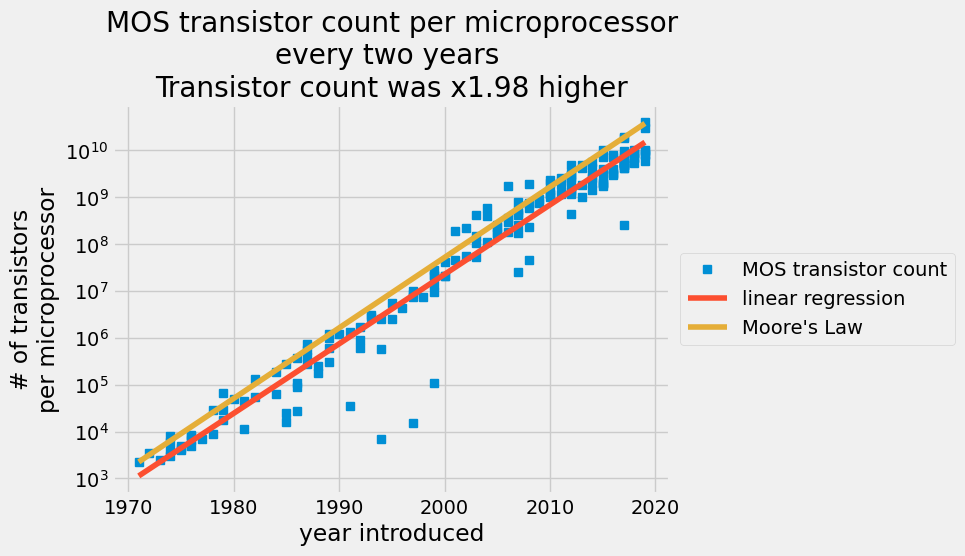
In 1965, engineer Gordon Moore predicted that transistors on a chip would double every two years in the coming decade [1]. You’ll compare Moore’s prediction against actual transistor counts in the 53 years following his prediction. You will determine the best-fit constants to describe the exponential growth of transistors on semiconductors compared to Moore’s Law.
Your empirical model assumes that the number of transistors per semiconductor follows an exponential growth,
where
- the number of transistors double every two years:
transistors_count(year+2) = 2* transistors_count(year) - start at 2250 transistors in 1971:
transistors_count(1971) = 2250
Implement the functions marked as task 4.1.
Task 4.2.: implement the function to load the data from a .csv file using np.loadtxt. Import only the second and third rows and skip the first row. The function must return a numpy array where the first column contain the years and the second column the number of transistors.
Now we want to estimate y_i = log(transistors_count_i). The best fit can be obtained via minimization of the least-square problem:
In task 4.3, you will implement a least square problem solver. Given a design matrix
Hint: Use
np.linalg.inv.
Task 4.4.: Now you can implement the function fit_moore_law to find the constants
Hint: You can implement the design matrix as
X = np.vstack([years, np.ones_like(years)]).T
In task 4.5. you will implement a function that predicts the transistor count given the year using the constants with the best fit to the past data, analogous to the Moore's Law prediction function fo task 4.1.
Finally, plot the data and predicted values using the implemented functions to create a plot similar to: