The trend analysis engine for a specific keyword of Twitter by using a graphical chart and geographical chart.
https://www.slideshare.net/izie00/twitter-trend-analyzer
- Twitter is one of popular social networking tools to share our think or news, and it will rapidly spread across the worlds.
- This project is a web application to collect the Twitter's feeds related to the specific word, and then provide the user a daily trend by using a real-time linear chart and geographical chart.
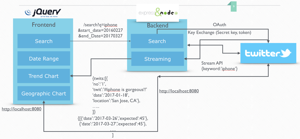
In this project, we basically implemented both backend and frontend. We used the Twitter’s Stream API in order to track of public user’s twits. The streaming data from Twitter is coming simultaneously when user write down some twits. Once our backend received the tweet, we then call the web socket’s handler in the backend. Since the WebSocket handler is connected between frontend and backend, frontend also can recognize and receive when the streamed tweet is arrived.
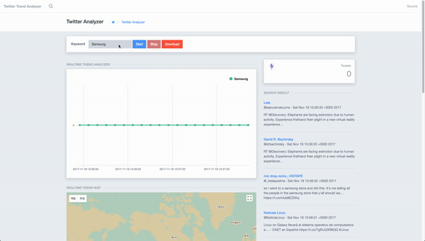
In the frontend aspect, it consists of four parts:
- Search Bar: user can input his/her own interested keyword such as “Samsung” or “Apple
- Real-time Tweets: Once user start the program with keyword, the streamed tweets are appeared in this layer.
- Linear Chart: The responsive chart will also start by using the streamed data so that user can easily understand what’s going on in the real-time
- Geographical Chart: Similar as linear chart, geographical chart will show the location of user who did post related of the keyword.
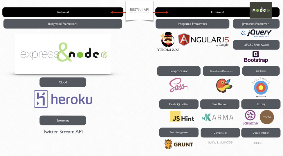
Backend Framework: Node.js with Express.js Dependencies Management: Bower, NPM Bootstrapping: Yeoman WebSocket library: Socket.io Testing: Jasmin/Karma Task Management: Grunt
// Twitter Stream API

app.get('/streamTweets', function(request, response){
  var keyword = request.param('keyword');
  response.set('Content-Type', 'application/javascript');
  client.stream('statuses/filter', {track: keyword}, function(stream) {
    stream.on('data', function(event) {
      //console.log(event && event.text);
      response.send(JSON.stringify(event));
    });

    stream.on('error', function(error) {
      //console.log(error);
    });
  });

});
In this project, we implemented a hashmap global_datas to handle the collected data. While the key value is the date of the collected data, the value is the number of tweets related to our keyword. We also have two other arrays which contain the key global_categories and the value global_series.
If we cannot find the key in the hashmap, we will create a new pair of key-value. Otherwise, we will increase the corresponding value by one when we find the key in the hashmap. In additions, the values of keys and values stored in hashmap will be use for x-axis and y-axis of our charts.
...
chart: {
          ...
          events:{
            load: function () {
              var self = this;

              socket.on('tweets', (tweets) =>{
                  // DOM appending
                  if(is_started === 1){

                    const { created_at } = $.parseJSON(tweets);

                    const date = moment(created_at, 'dd MMM DD HH:mm:ss ZZ YYYY', 'en').format("YYYYMMDDhmmss");

                    if(global_datas[date] === null || global_datas[date] === undefined)  global_datas[date] = 1;
                    else {
                      global_datas[date]++;
                    }

                    var date2 = moment(created_at).toDate();
                    self.series[0].addPoint([moment(created_at, 'dd MMM DD HH:mm:ss ZZ YYYY', 'en').toDate().getTime(), global_datas[date]],true,false);//add to last
                  }
              });
                }
          }
},1) HighCharts: http://highchart.com
- Http://www.highcharts.com/ Enter the site and go to the first download. (The current version is 3.0.9.)
- After downloading the module, extract it to a specific directory.
- Enter the following script in the HTML file:
- <Script src = "directory/highcharts.js">
- <Script src = "directory/highcharts-more.js">
- <Script src = "directory/modules/exporting.js">
- Then draw the graph in JavaScript. Please refer to the following reference or demo site for how to draw the graph.
- API reference site: http://api.highcharts.com/highcharts
- Demo site: Http://www.highcharts.com/demo/ Highcharts span up to 1000 on Internet Explorer. Perhaps the memory limit is there. The graph type can be selected from the demo site. The high chart has a different shape of the json arrangement of the X and Y axes. The data corresponding to the X axis must be made like this. This is the array type of json. You can assign the x-axis data to the x-axis of the high chart and draw the series by assigning the y-axis value.
2) Google Map API: https://developers.google.com/maps/?hl=ko

[Prerequisite]
- Node.js
- Twitter Developer Keys (See: https://developer.twitter.com/en/docs/basics/authentication/guides/access-tokens)
- Google Map API Keys (See: https://developers.google.com/maps/documentation/embed/get-api-key)
[Installation]
- Clone the repository: git clone https://www.github.com/IkwhanChang/twitter-trend-analyzer.git
- Go to twitter-trend-analyzer folder
- Install dependencies: npm i or npm install (make sure you already installed the node)
- Go to index.js file and replace Twitter keys for yours
// Twitter Settings

var client = new Twitter({
  consumer_key: '[YOUR_CONSUMER_KEY]',
  consumer_secret: '[YOUR_CONSUMER_SECRET]',
  access_token_key: '[YOUR_ACCESS_TOKEN_KEY]',
  access_token_secret: '[YOUR_ACCESS_TOKEN_SECRET]'
});- Go to /public/js/script.js file and replace Google Map API key for yours
const google_api_key = "[YOUR_GOOGLE_API_KEY]";- Run the command: node index.js
- Open the browser and connect: http://localhost:5000/
- Usage is very simple. Just write down the keyword that you want to find, click the [Start] Button, then see the result via Charts and list of result in right sidebar. The data will be automatically updated. If you want to stop, then click the [Stop] button.
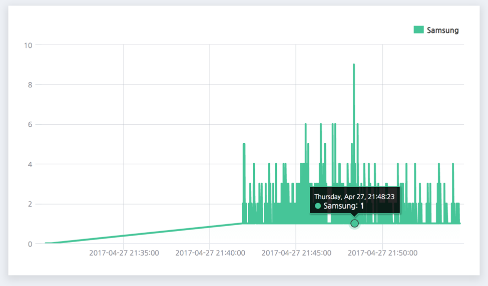
- In the linear charts, you can see the result of streamed Twitter data. The x-axis is time and y-axis is number of twits. Also, you can see the geographical charts that has Twitter icon of user's location.
- If you wish to download of the result, simply click the [Download] button. Then you can get the CSV file and use of it whatever you wants.