Useful blazor components
You can install package from nuget
<PackageReference Include="CrahunBlazorComponents" Version="2.5.5" />
This library relies on bootstrap 4 so if need it you can link it from the library
<link href="_content/CrahunBlazorComponents/bootstrap/bootstrap.min.css" rel="stylesheet" />@using CrahunComponents
<SkeletonTable NumberOfColumns="4" IsLoading="isLoading" ShouldAnimate="true">
    <ChildContent>
        <tr>
            <td>
                Value1
            </td>
            <td>
                Value2
            </td>
        </tr>
    </ChildContent>
    <Head>
        <tr>
            <th>
                Column1
            </th>
            <th>
                Column2
            </th>
        </tr>
    </Head>
</SkeletonTable>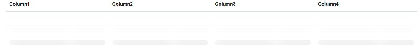
<SkeletonCards IsLoading="isLoading" ShouldAnimate="true">
    <div class="col-sm-4">
        <div class="card">
            <div class="card-header" data-simplebar>
                <h3 class="card-title">Title</h3>
            </div>
            <div class="card-body" data-simplebar>
                This is the body
            </div>
            <div class="card-footer text-right">
                This is the footer
            </div>
        </div>
    </div>
</SkeletonCards>
The wizard component Will show steps in certain order. Steps can contains any other components, html or whatever you want.
This component is based on creative Tim jquery wizard.
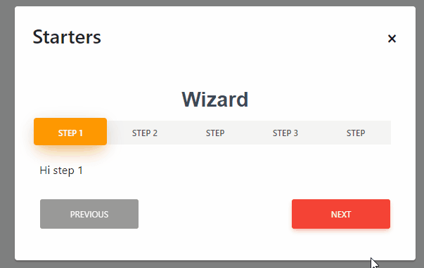
<Wizard Title="Wizard" Theme="Theme.Orange">
    <Step Name="Step 1">
        <div>Hi step 1</div>
    </Step>
    <Step Name="Step 2">
        <div>Hi step 2</div>
    </Step>
    <Step>
        <table>
            <thead>
                <tr>
                    <th>Id</th>
                    <th>Name</th>
                </tr>
            </thead>
            <tbody>
                <tr>
                    <td>1</td>
                    <td>Name</td>
                </tr>
            </tbody>
        </table>
    </Step>
    <Step Name="Step 3">
        <div>Adios paso 4</div>
    </Step>
    <Step>
        <div>Hi step 3</div>
    </Step>
</Wizard>First you can customize the wizard colors with de Theme enum
public enum Theme
{
    Purple,
    Green,
    Blue,
    Orange,
    Red
}
You can customize the buttons meaning and color with the Buttons enum
public enum Buttons
{
    Default,
    Simple,
    Primary,
    Info,
    Success,
    Warning,
    Danger
}[Parameter]
public EventCallback OnPrevious { get; set; }
[Parameter]
public EventCallback OnNext { get; set; }
[Parameter]
public EventCallback OnFinished { get; set; }
[Parameter]
public EventCallback<int> OnSelectedStep { get; set; }[Parameter]
public Buttons PreviousButtonClass { get; set; } = Buttons.Default;
[Parameter]
public Buttons NextButtonClass { get; set; } = Buttons.Danger;
[Parameter]
public Buttons FinishButtonClass { get; set; } = Buttons.Danger;
[Parameter]
public string NextButtonText { get; set; } = "Next";
[Parameter]
public string PreviousButtonText { get; set; } = "Previous";
[Parameter]
public string FinishedButtonText { get; set; } = "Finished";IsFirstStep()
IsLastStep()
SetActivePage(int currentIndex)
NextPage()
PreviousPage()
This component will show any image with transitions when it's fully loaded. When it's loading it will show an skeleton ui or whaterever you like.
<LazyImage ImageUrl="@($"{configuration["Urls:AuthServer"]}/images/Uploaded/{Category.PhotoUrl}")"
                           Alternative="@Category.Name" AdditionalClasses="img-responsive">
</LazyImage>You can customize the image itself with the following params
[Parameter]
public string ImageUrl { get; set; }

[Parameter]
public string Alternative { get; set; }

[Parameter]
public string AdditionalStyles { get; set; }

[Parameter]
public string AdditionalClasses { get; set; }

[Parameter]
public string ImagePlaceHolderWidth { get; set; } = "100%";

[Parameter]
public int ImagePlaceHolderHeight { get; set; } = 200";

[Parameter]
public RenderFragment LoadingPlaceHolder { get; set; }
The loading placeholder is just a div that will show when image is loading. By default is a skeleton-ui but can be replaced by spinner or whatever you need.

This component will wrap the blazor InputFile component with the ability to paste from image and drag and drop files. It supports image preview and customizations.
This component is based and adapted from Meziantou's blog. All the effort is from him.
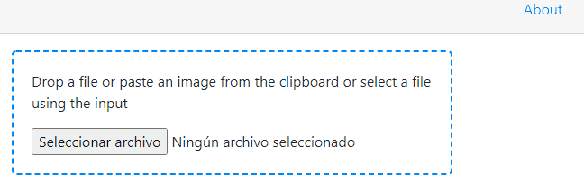
- Basic usage
<DragDropUploadFile />- Customized usage
<div class="row">
    <div class="col-10">
        <DragDropUploadFile OnFileSelectionChanged="OnChange" ShowImage="false" InformationText="Sample to upload file with custom format"/>
    </div>
    <div class="col-2">
        <img src="@src" style="max-width: 100%" />
    </div>
</div>
And the corresponding code
@code {
    string src;

    // Called when a new file is uploaded
    async Task OnChange(InputFileChangeEventArgs e)
    {
        using var stream = e.File.OpenReadStream();
        using var ms = new MemoryStream();
        await stream.CopyToAsync(ms);
        src = "data:" + e.File.ContentType + ";base64," + Convert.ToBase64String(ms.ToArray());
    }
}You can customize this component with the following params
[Parameter]
public string InformationText { get; set; }

[Parameter]
public bool ShowImage { get; set; }

[Parameter]
public EventCallback<InputFileChangeEventArgs> OnChangeImage { get; set; }This component wraps boolean value inside a customizable switch intead of checkbox. It allows doble-way binding as any other blazor input component.

<EditForm Model="person">
    <InputSwitch Label="Are you adult?" @bind-Value="@person.IsAdult"></InputSwitch>
</EditForm>You can customize this component itself with the following params
[Parameter]
public string Label { get; set; }

[Parameter]
public bool Value { get; set; }

[Parameter]
public EventCallback<bool> ValueChanged { get; set; }This component shows button text or bootstrap spinner while controlling its IsLoading property.

<div class="d-flex">
    <LoadingButton OnClick="ToggleButton" @bind-IsLoading="isLoading" class="btn btn-primary mt-3 ms-auto me-auto" type="submit">
        <LoadingTemplate>
            <div class="d-flex">
                <span class="spinner-border ms-auto me-auto" role="status" style="color: red">
                    <span class="sr-only">Loading...</span>
                </span>
            </div>
        </LoadingTemplate>
        <ButtonTextTemplate>
            <span>Hola</span>
        </ButtonTextTemplate>
    </LoadingButton>
</div>You can customize this component itself with the following params
[Parameter]
public bool IsLoading { get; set; }

[Parameter]
public EventCallback<bool> IsLoadingChanged { get; set; }

[Parameter]
public RenderFragment ButtonTextTemplate { get; set; }

[Parameter]
public RenderFragment LoadingTemplate { get; set; }

[Parameter]
public EventCallback<bool> OnClick { get; set; }

[Parameter(CaptureUnmatchedValues = true)]
public Dictionary<string, object> AdditionalProperties { get; set; }